
When I came to NYC, I found there are many ways to interactive with cards. People here use so many cards!! Everything can be finished by just pass the card in front of the machine. It's common to go out with no cash, Debit cards, Credit Cards, Metro Cards..People buy things and take subway by passing those different kinds of cards, getting well with different card machine is not an easy task, because every machine has different mechanism. Ticket Vending Machine
1)there are several output and input window to exchange information with extra world. And we also use these windows to transmit information with machine.
That's analyze the output and input machoism for this machine.
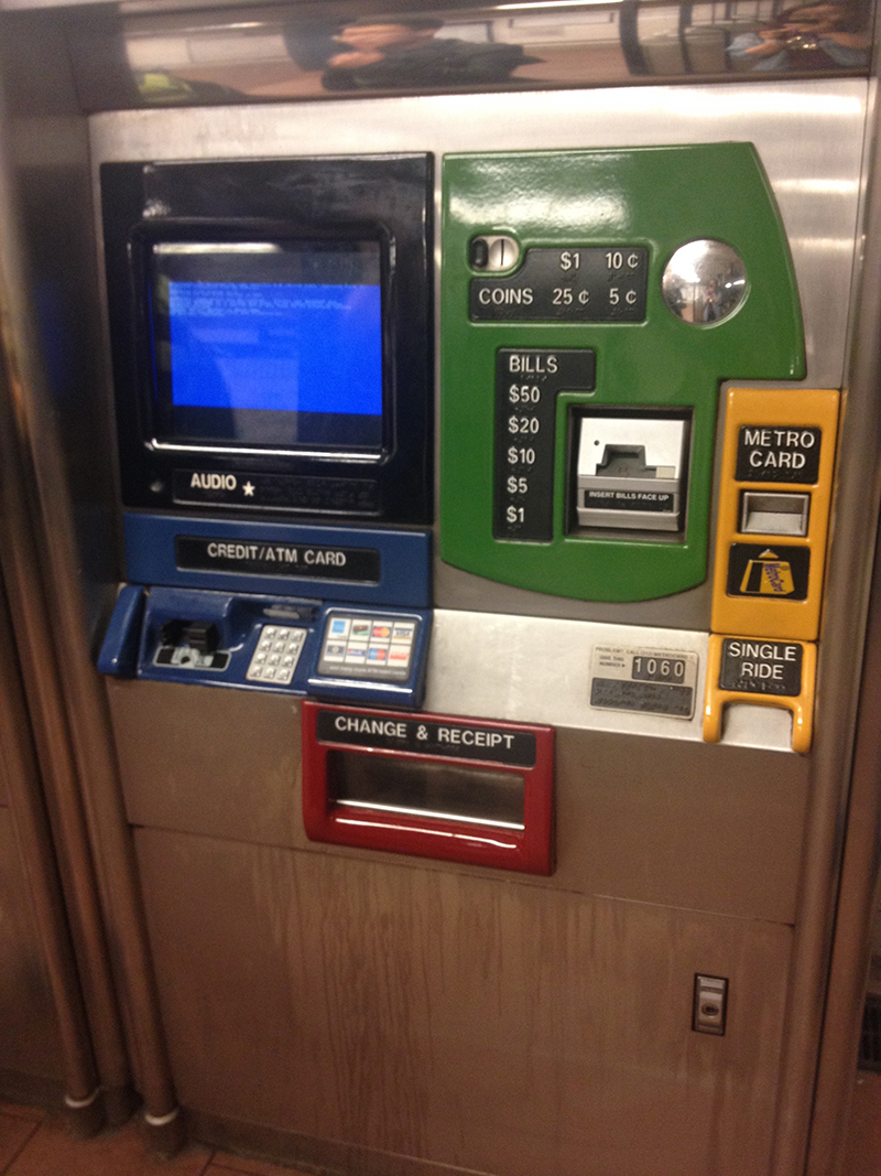
Output:
1. Screen on the left; (users reading the conduction on screen and follow the feedback on it. Through all steps.)<BLACK>
2. Change and receipt window (Users get receipt/MetroCard/Change money through this window. Last step.)<RED>
3.Single Ride(Final step)<YELLOW>
Input:
Number button(credit number)<BLUE>
Show Metro Card: Refill Card<YELLOW>
Pay:
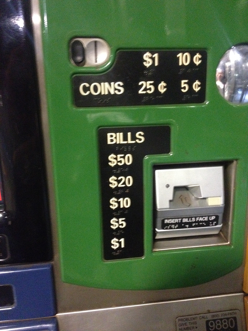
1.Coin <GREEN>
2.Bill <GREEN>
3.Credit/ATM Card <BLUE>
VTM Machine divide these different parts in different, people usually regard things which is arranged together(arranged in the same way, in same color)have the same function. and believe things arranged logically, so if two parts near each other, they may have a kind of Correlation between them . According to Donald Norman's Design of Everyday things , This kind of correlation can help Users understand the conceptual model. And let's see how this machines arrange windows with different functions.
<Black>
Output-Screen
<Blue>
Input-Pay- Credit Card
Input-Pay- Input credit number
<Green>
Input-Pay- Coins
Input-Pay- Bills
<Yellow>
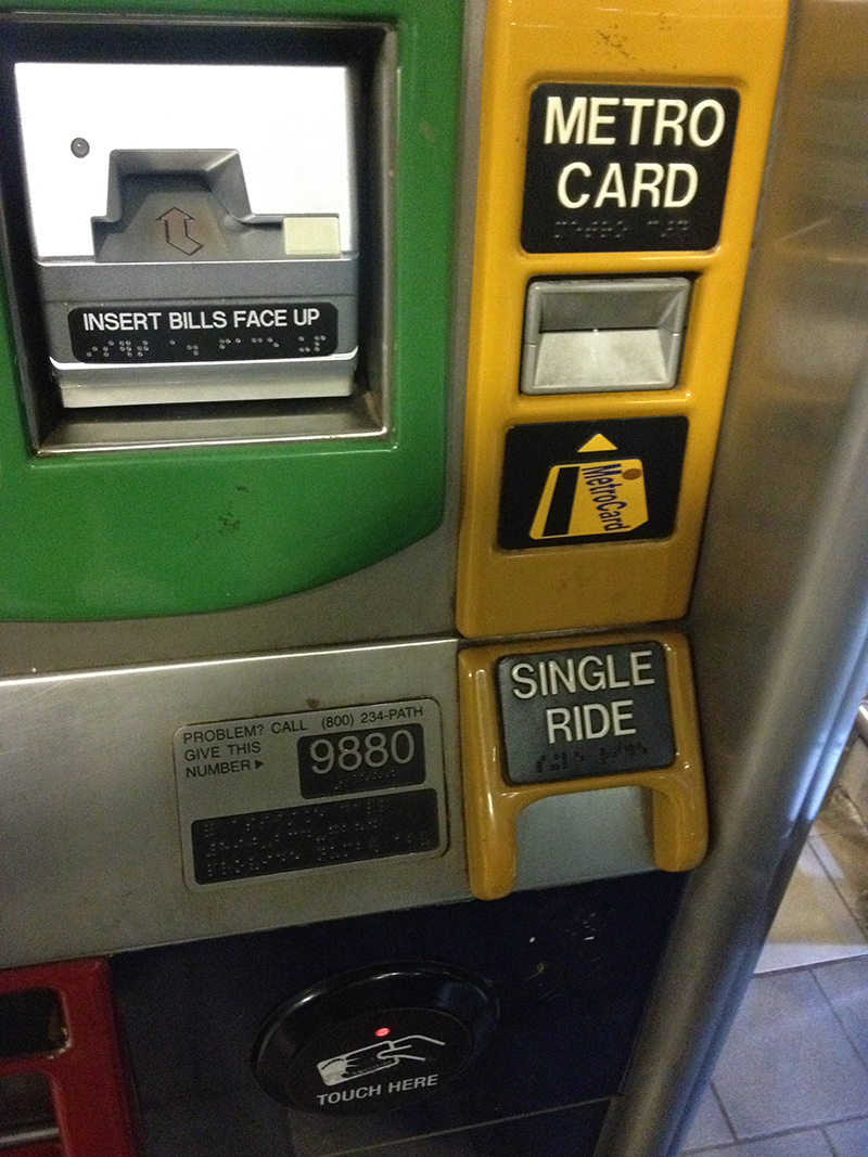
Input-MetroCard
Output-SingleRide
<Red>
Output-Changes and Receipt
It seems logical, but divide parts in so many color and arranged these output input windows in decentralized way. That's so confused because people see so much windows--pay money,pass card,receive card..not sure which window is for their steps in the present. Meanwhile, as we see, windows who has the same target is divided into different colors(Cash pay and Credit pay), as well as windows for different target arranged together (Output and Input part all in Yellow part).
2) Steps to buy a ticket
(1) Select the Metro Card type- Fast Get New One($10)/ Metro Card/ Buy single ride one.
(2)If choose Metro Card, then you should choose Refill new one/ Buy new one/or read the info. It's a little bet confused that the 3 options arranged in this way. info is in the center and Refill card and get new one in two sides. Designer makes them in different size, in order to Emphasize the importance of Refill card. But the order of arrangement is illogical.


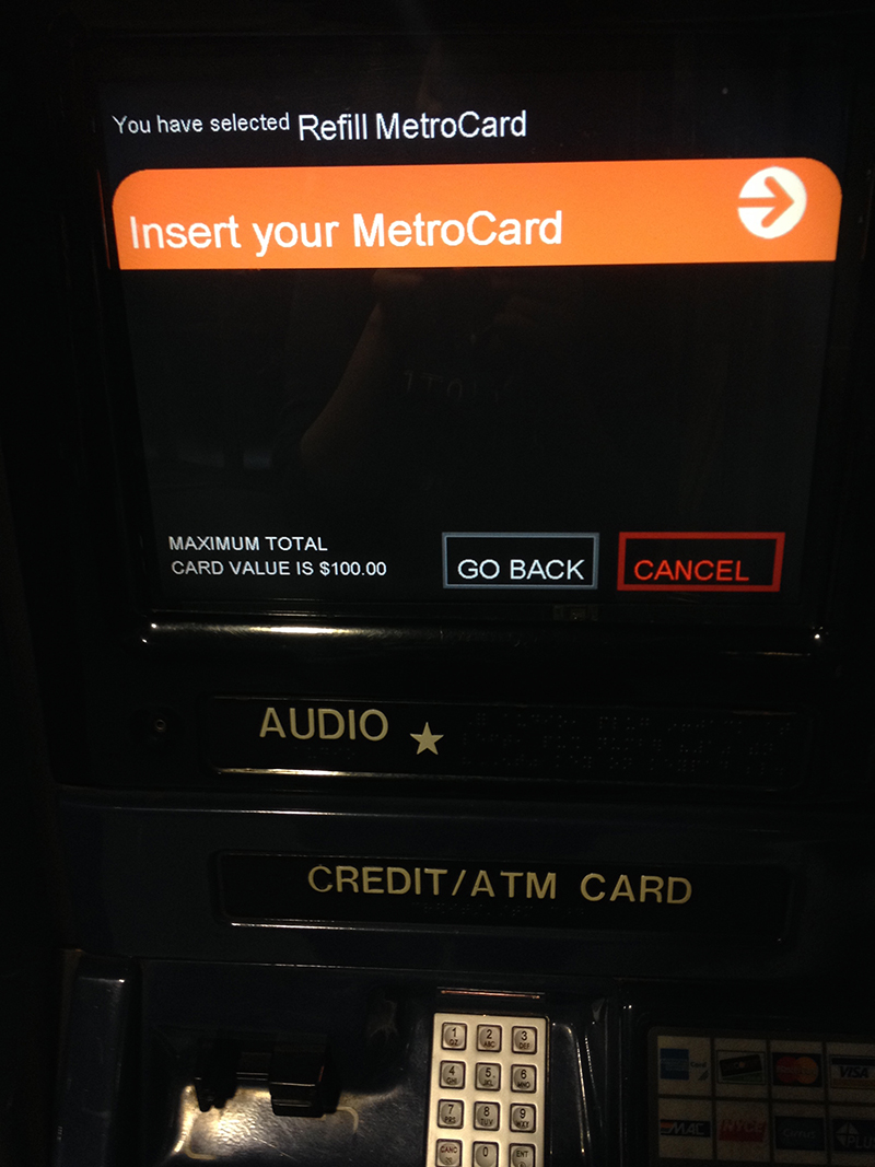
(3)Refill Metro card-Insert your card.
It has an arrow to conduct your action and help users find the correct window.
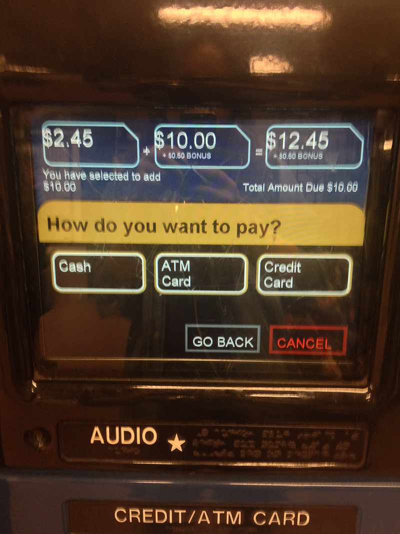
(4)Choose How much you want to pay
It has three default value(10,20,40) and you can also pay other amount but press other amount
(5)Choose the way to pay
It has three default way- Cash/ ATM card / Credit card, It has conduct arrow on the screen, It's really help for user to find correct window.


My observation:
Most people can follow the steps on the screen and buy a ticket finally. But since it has so many input and output windows in this machine , people who first uses it may get confused. Where to insert my card and where to get back card. And the way pass the card is also confused. I asked my Friends and classmates, most of us do not know before we should insert the credit card once and draw it out then. And how to put a credit card in the window, which face is toward the top, there's no tips for that step (I usually confused in many other situations about insert card, Which face is toward the top!!)
When you insert Metro card, it has a picture under the window, and you can understand how to insert it.
I think the machine is in logical, it's make most function visible to users, but the arrangement of colors and the order of the function, different size of buttons is less help to understand its way of work, so maybe these parts need more consideration.